
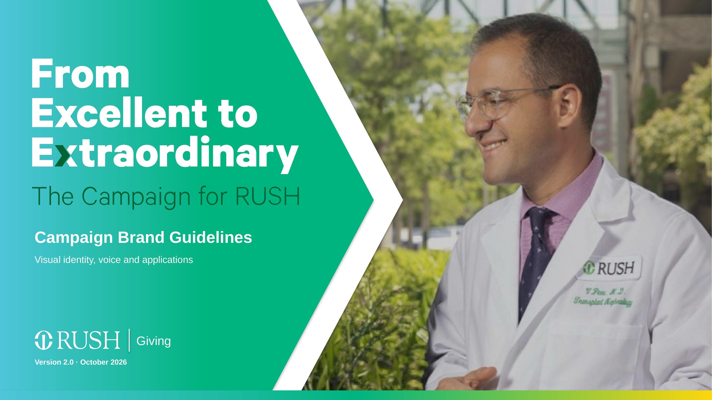
Strategy, then early concepts, then one final campaign carried across brand guidelines, out-of-home, print, digital and events.
Process · Step 1
Strategy
RUSH marketing already sold excellence. Philanthropy had to sell a future. I mapped the shift from Rush as a place, to Rush as an experience, to Rush as a vision donors could help build, and moved the voice from knowledgeable and warm to inspiring, confident and grateful.
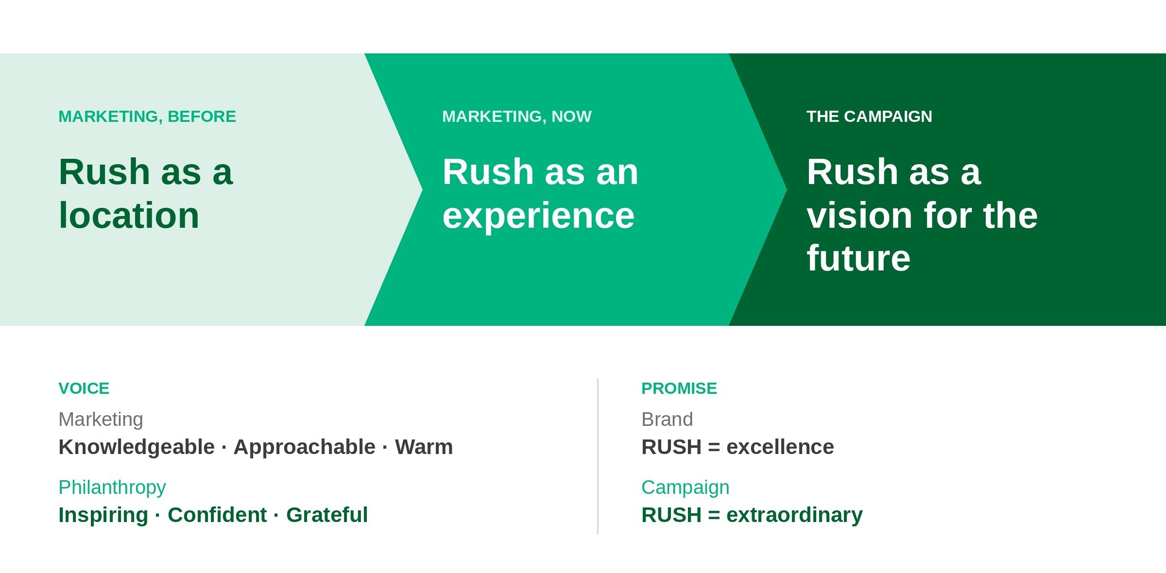
Positioning, voice and promise for the campaign.
Process · Step 2
Early concepts
Before landing on the final campaign, I explored three early directions, each with its own name, lockup, colorways and poster series. These were concept stage only; none of them went to market.
Early concept 1All InA rallying call for donors, staff and students, with a yellow dot over the “i.”
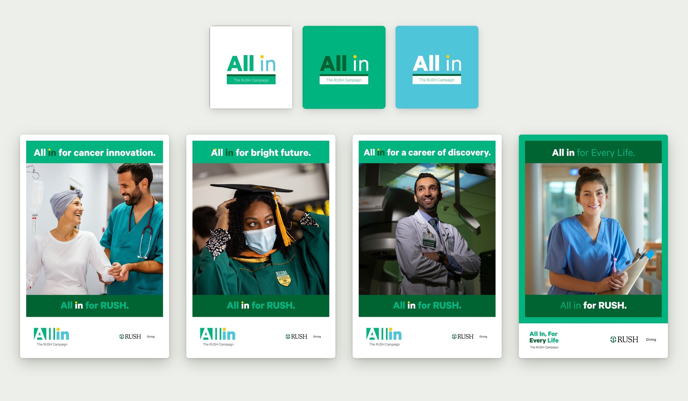
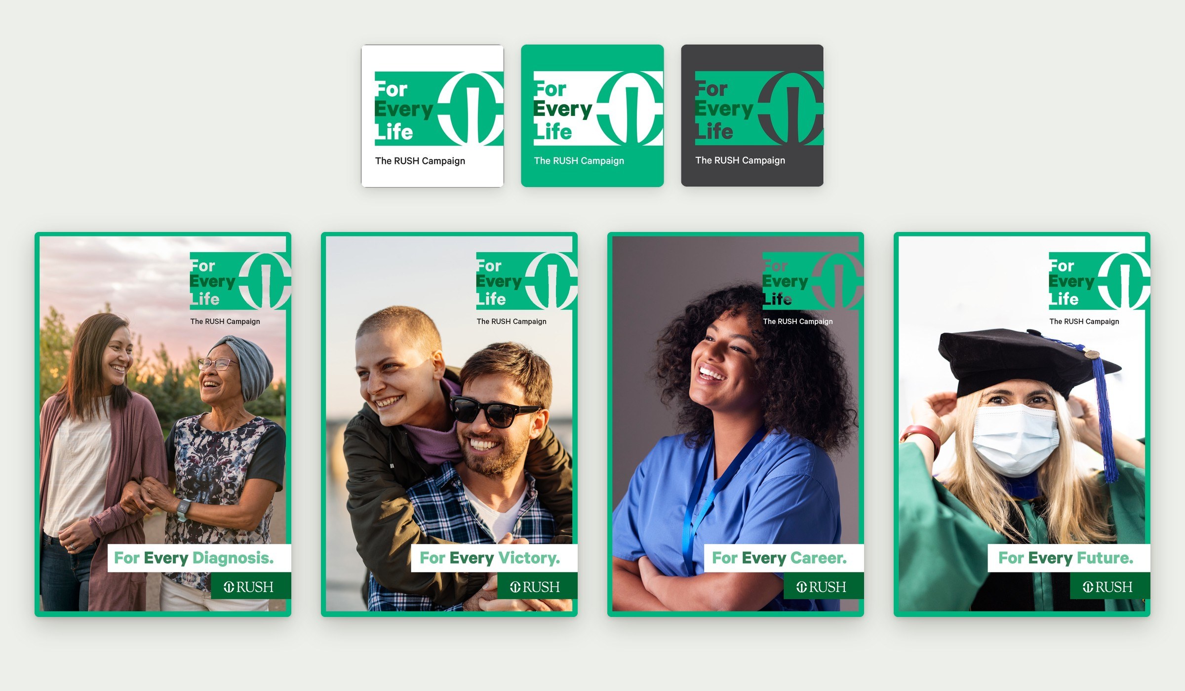
Early concept 2For Every LifeThe RUSH mark becomes the “O” in a bold block lockup. Each poster finishes the line: diagnosis, victory, career, future.
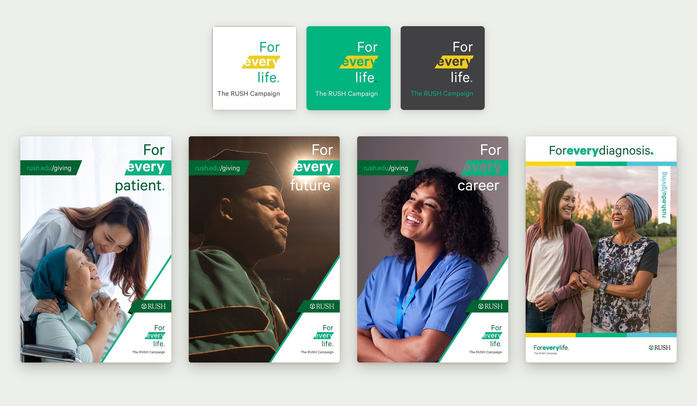
Early concept 3For every ___A yellow highlight carries the word “every” across patient, future and career posters.
Final concept
From Excellent to Extraordinary
The direction that moved forward. Everything from here down is the final campaign, built on one lockup, one chevron and one gradient.
The identity
The final lockup pairs the RUSH master brand with a forward-pointing chevron and a gradient from teal to green to yellow, standing for trust, growth and optimism.
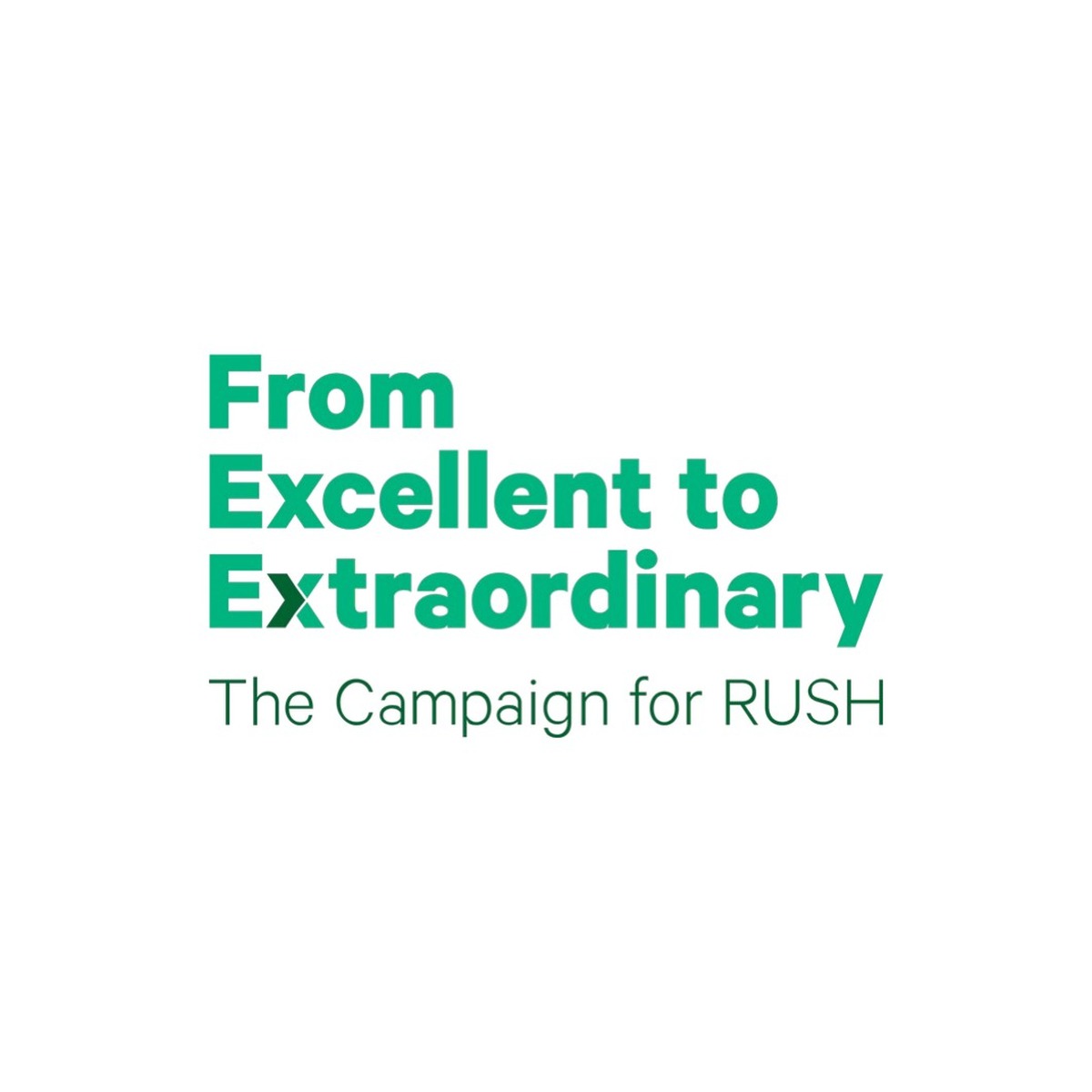
Primary lockup.
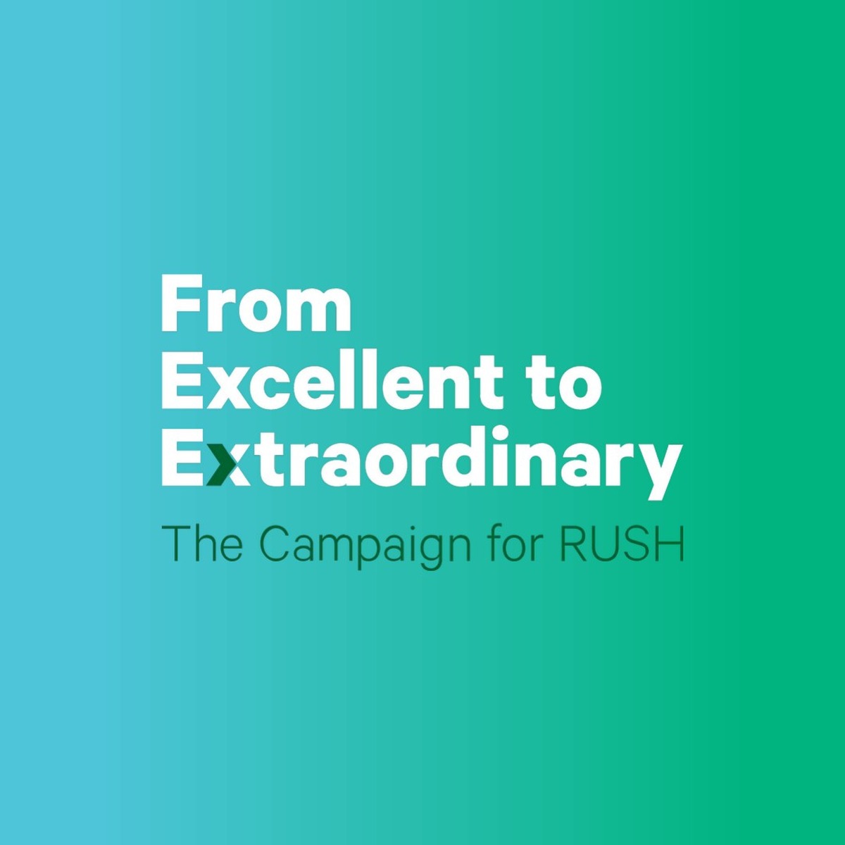
Reversed on gradient.
Reversed on dark green.
One color.

Color and type: Calibre, Tiempos and an Autography script accent.
RUSH Giving
I proposed RUSH | Giving as the fundraising lockup instead of RUSH | Philanthropy. “Philanthropy” is the department’s name; “Giving” is the thing a donor actually does. One plain word tells people what the page, email or post is asking of them.
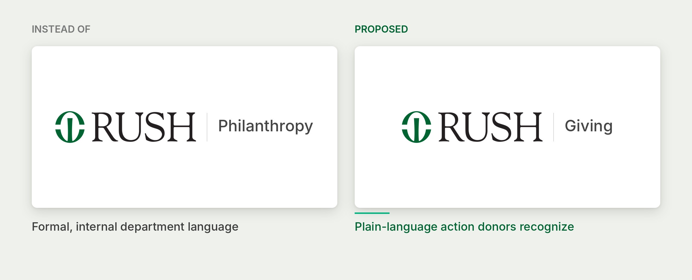
Same RUSH master brand and divider. The descriptor changes from an internal department name to a plain-language action.
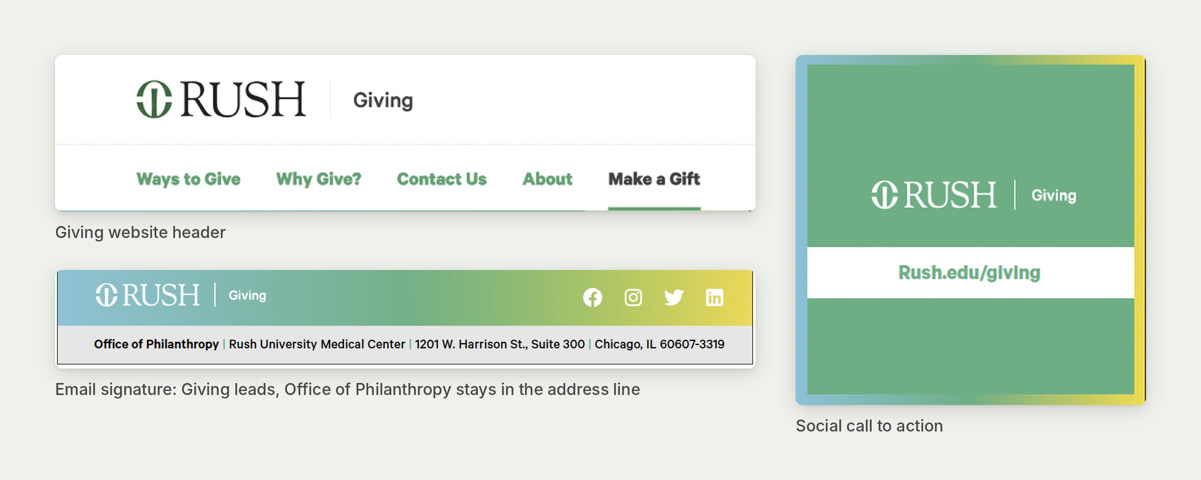
The lockup matches the rush.edu/giving address and the site navigation (Ways to Give, Make a Gift), so the name, the URL and the ask all say the same thing. Office of Philanthropy stays in the address line as the department of record.
Out of home

Expressway billboard.

Expressway billboard.
Posters
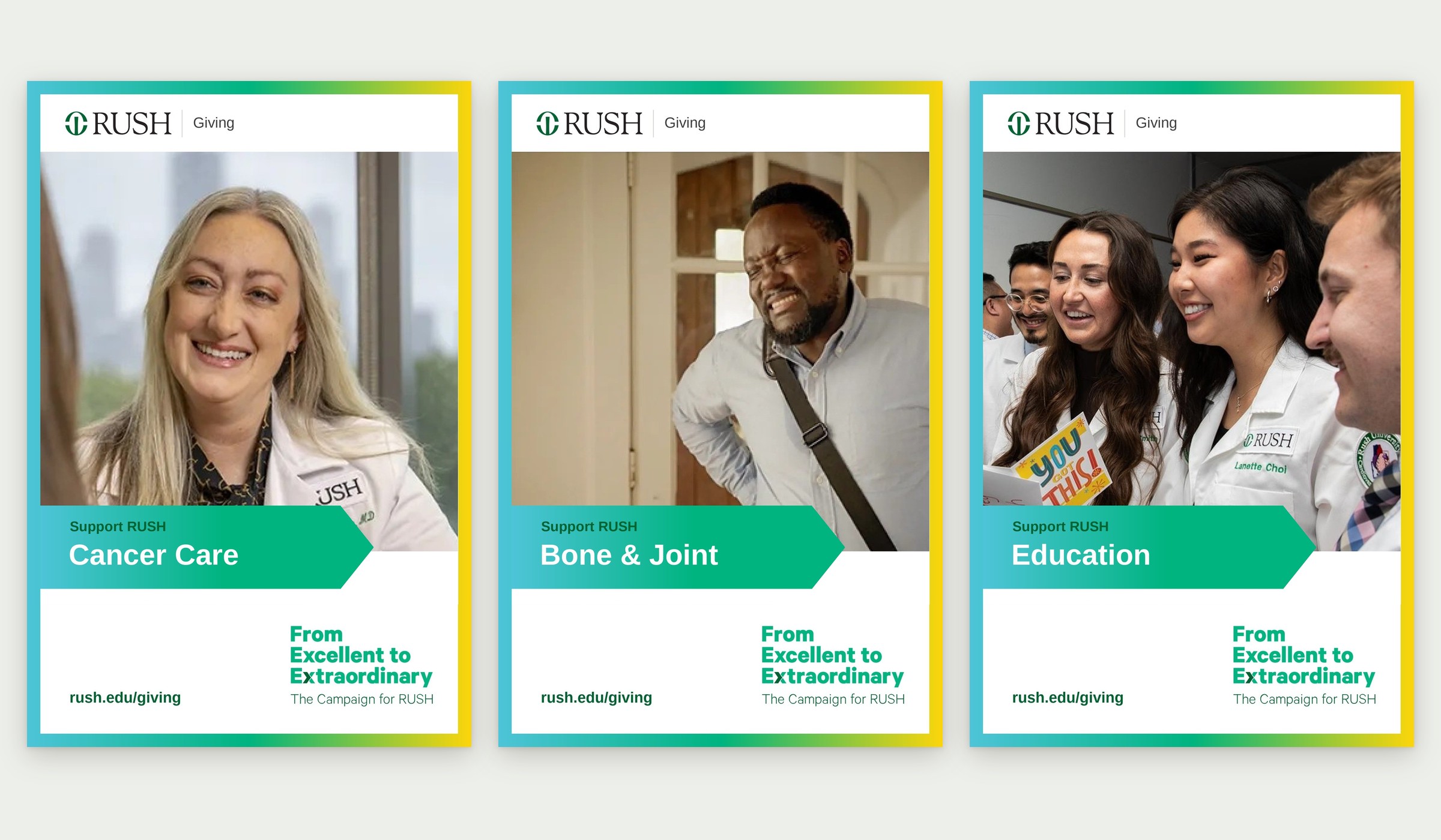
Support RUSH poster series.
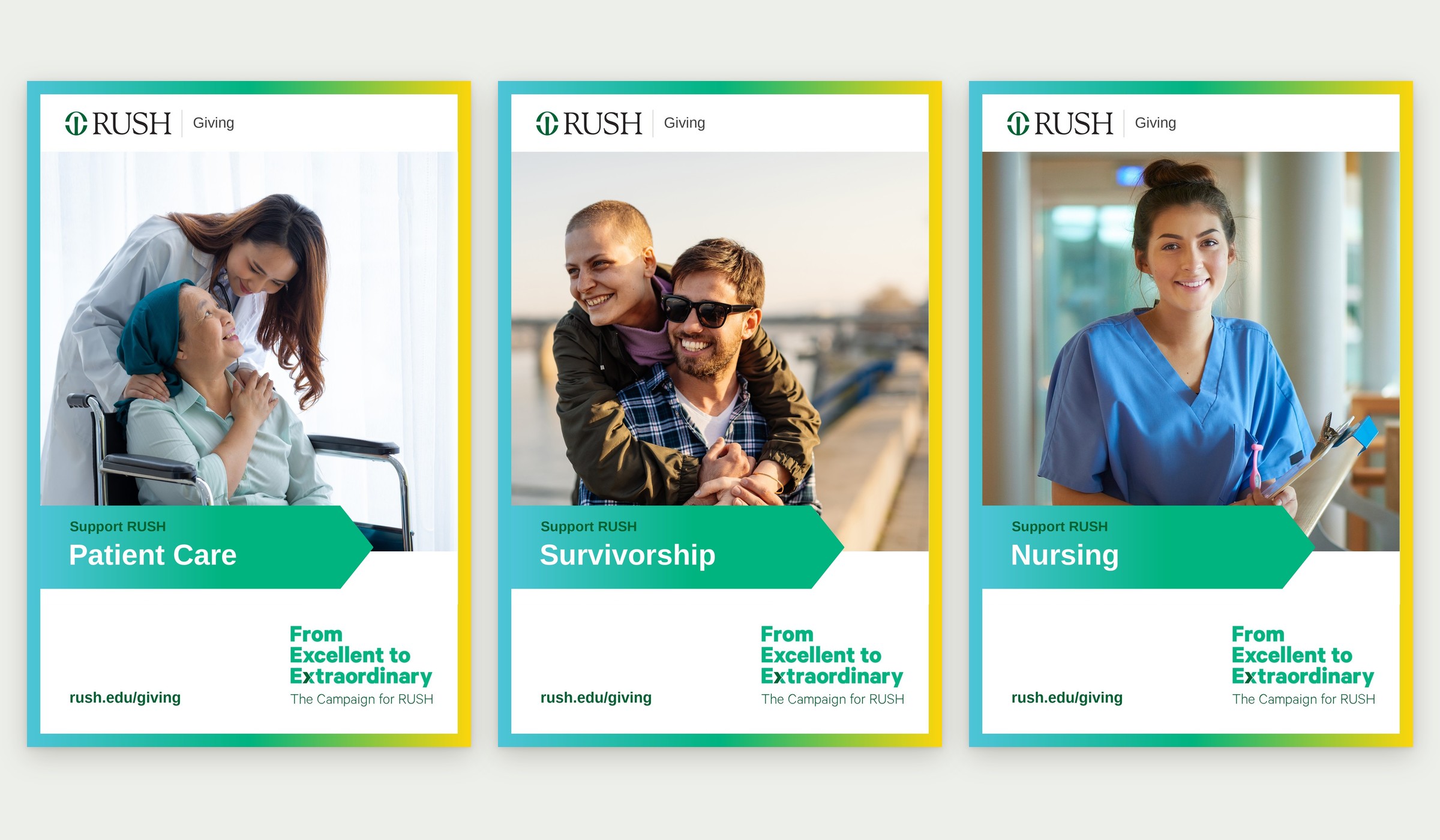
Photo variations extend the series to patient care, survivorship and nursing.
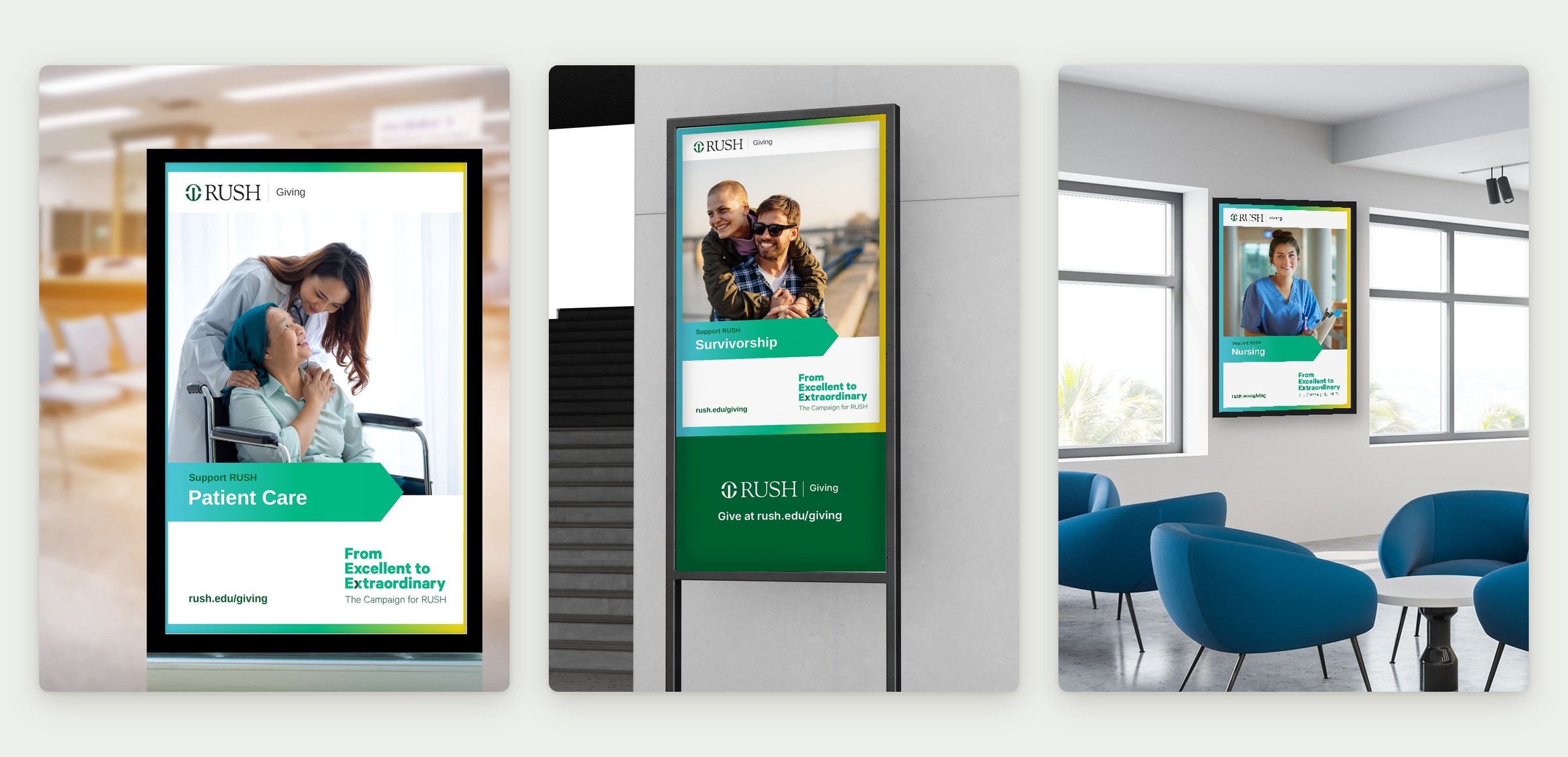
The variations in place: waiting-room lightbox, lobby sign stand and clinic waiting area.
Signage
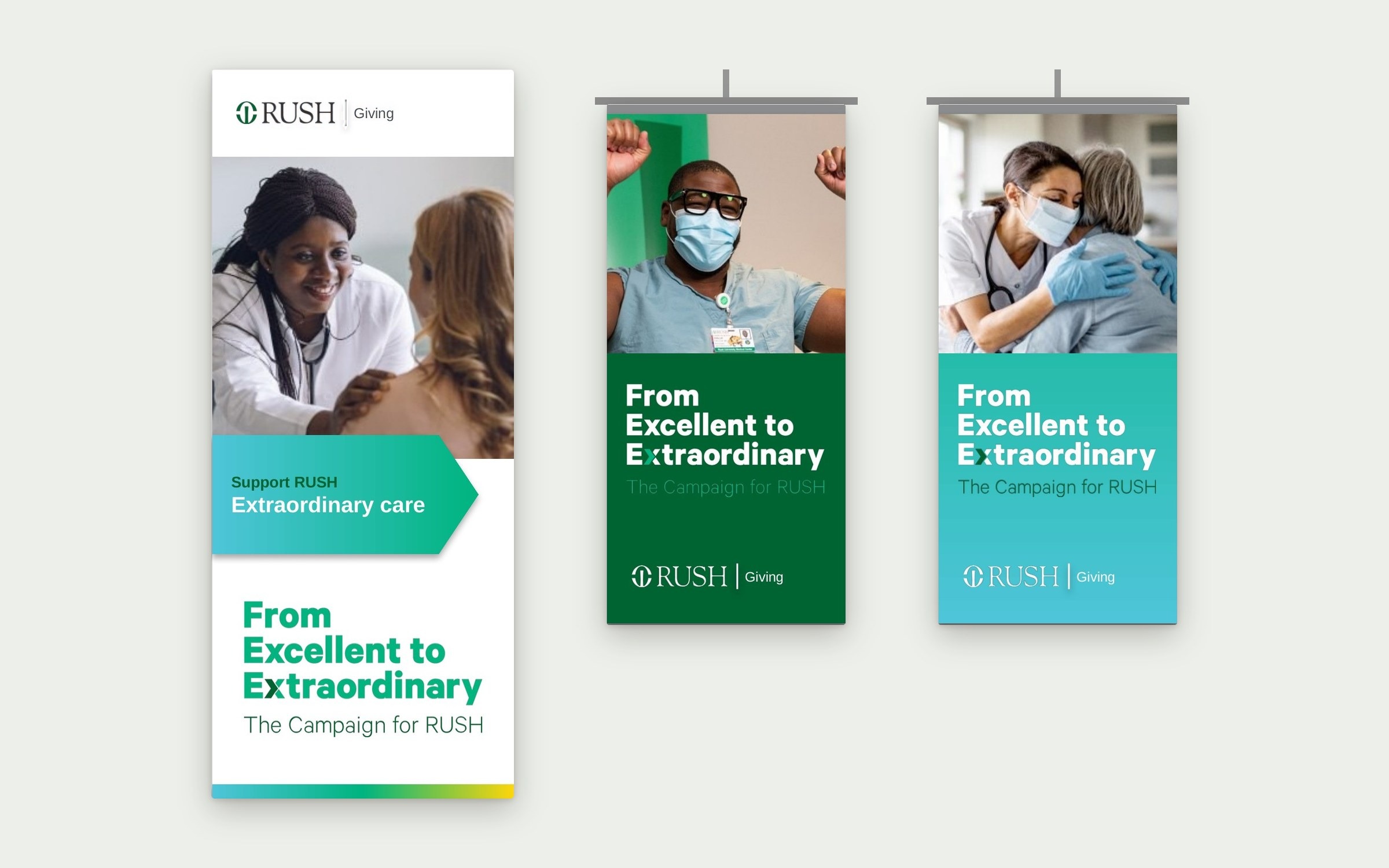
Retractable banner and pole banners.
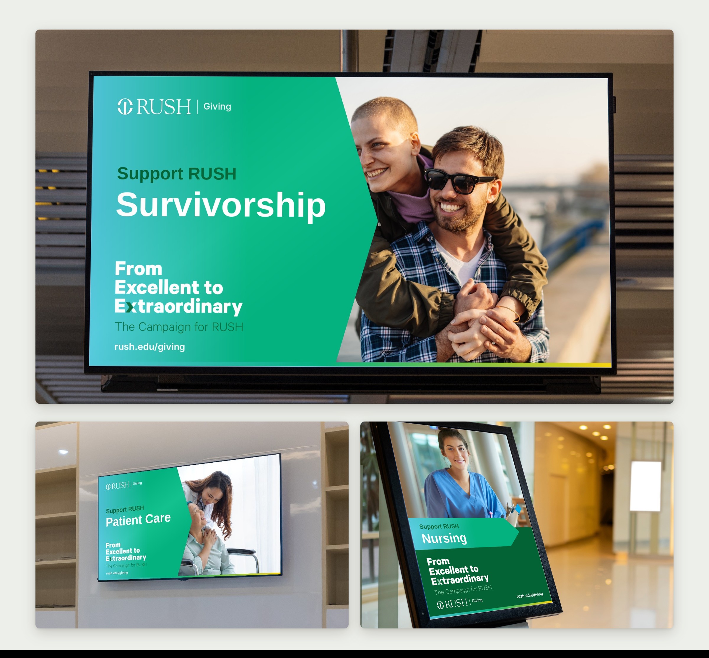
Digital signage: 16:9 and portrait versions of the series for lobby screens, waiting-room TVs and kiosks.
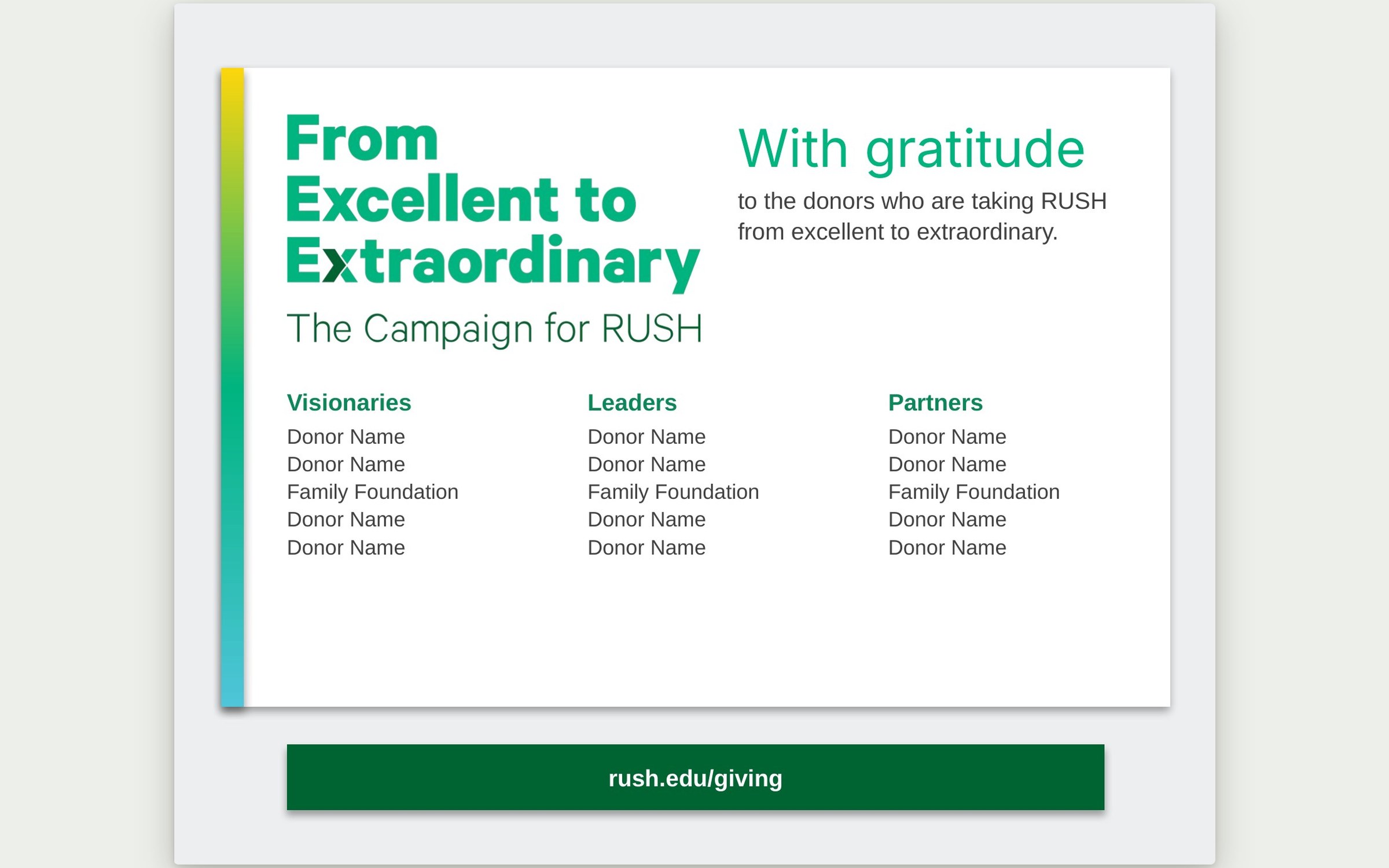
Donor recognition wall: With gratitude.
Direct mail
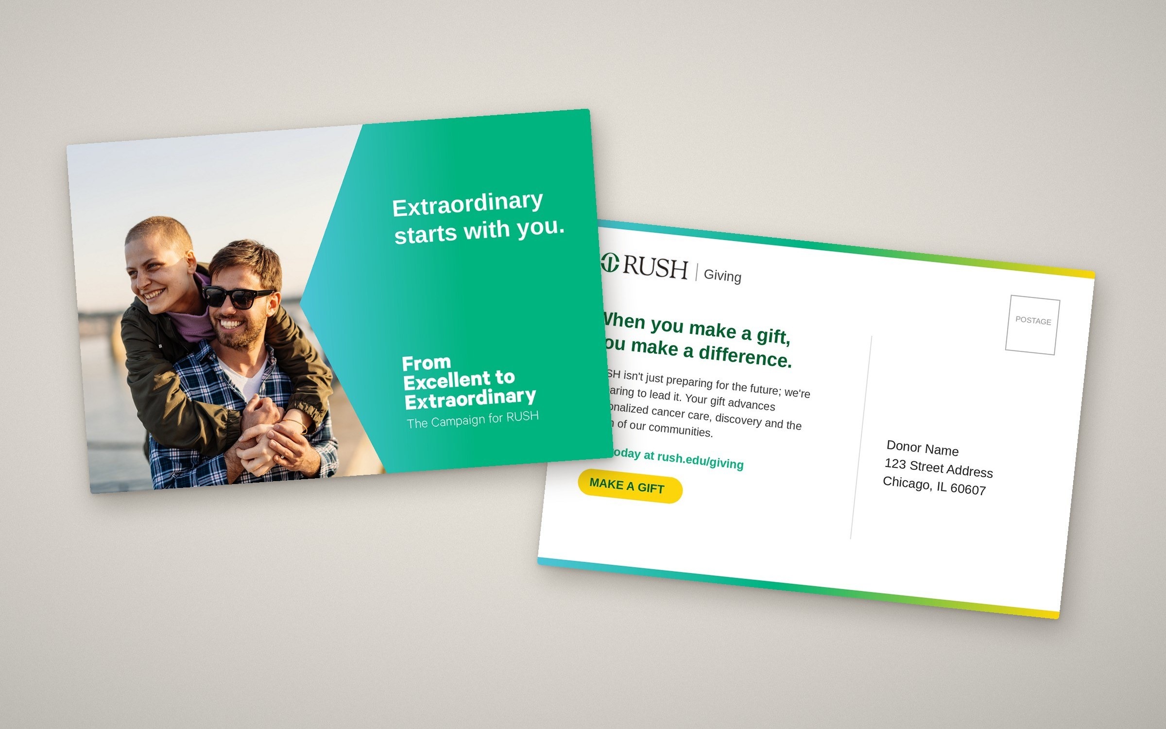
Giving postcard, 6 × 9 in., front and back.
Social
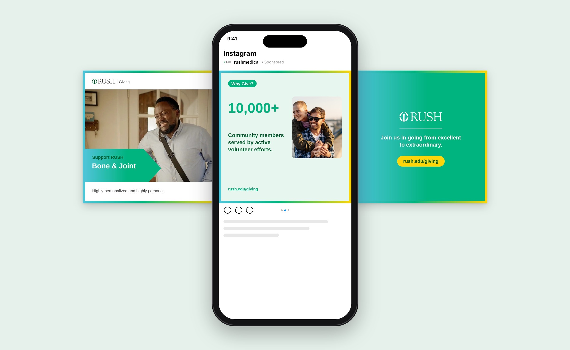
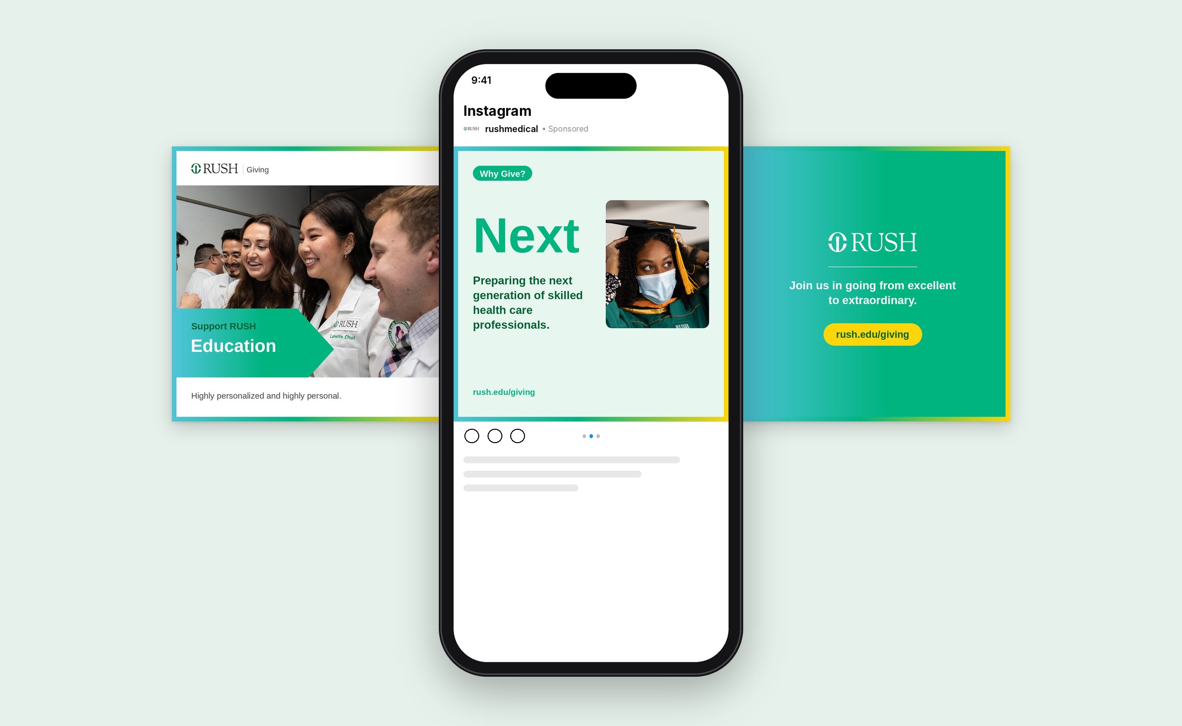
A three-post series for each campaign priority: an intro post, a Why Give? proof point and a call to action.
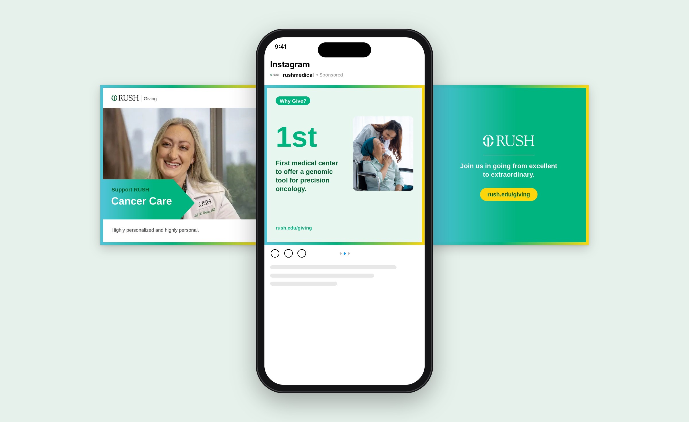
Cancer Care series, Instagram and Facebook, 1080 × 1080.
Social seriesBone & JointIntro, Why Give? proof point and call to action
Social seriesEducationIntro, Why Give? proof point and call to action
Digital
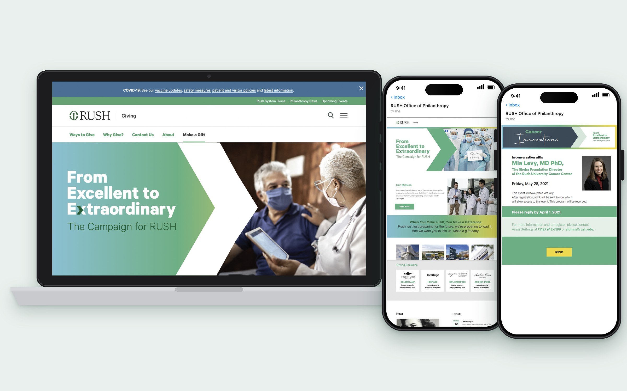
Giving page, campaign overview email and Cancer Innovations event email.
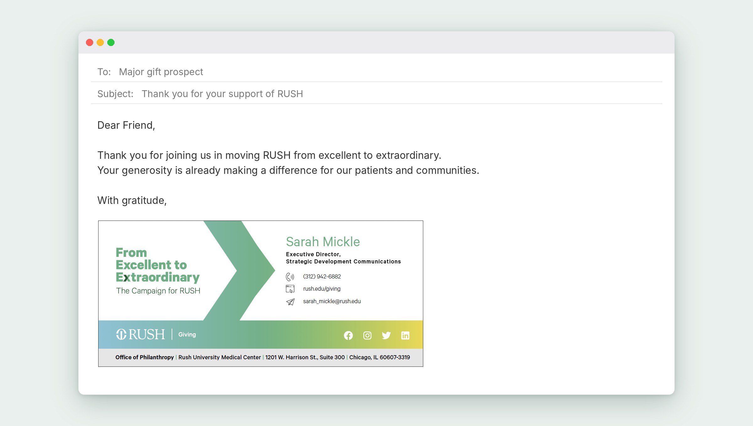
Email signature for gift officers.
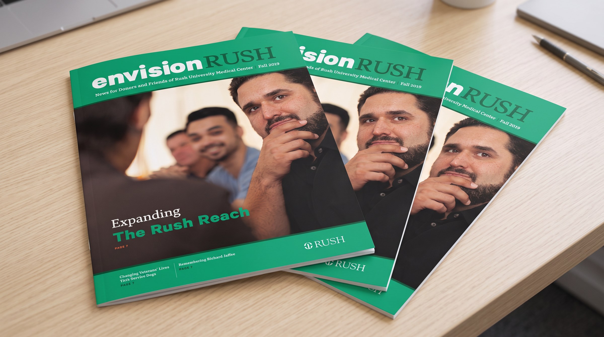
Envision RUSH donor magazine.
Fundraising events
The campaign also shows up in the room. I designed the event graphics for RUSH fundraisers, from invitations to room-scale banners and stage graphics.
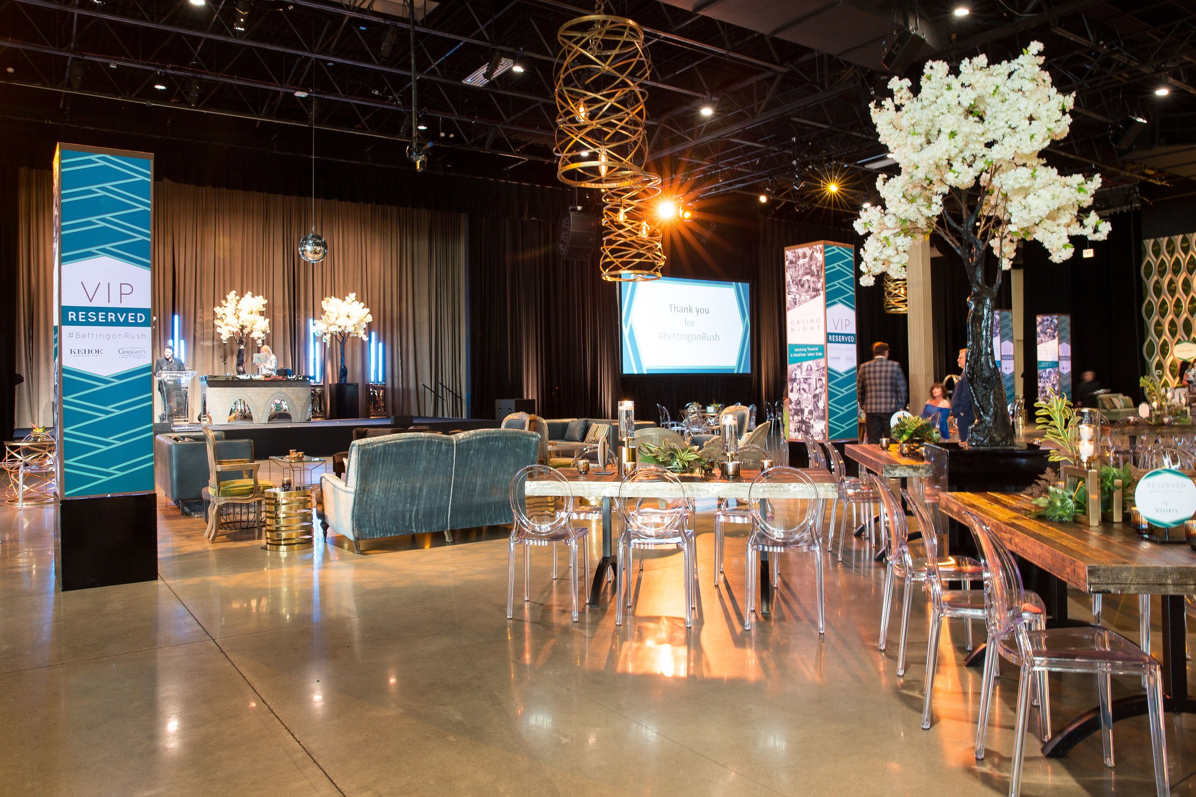
Fundraising event graphics.
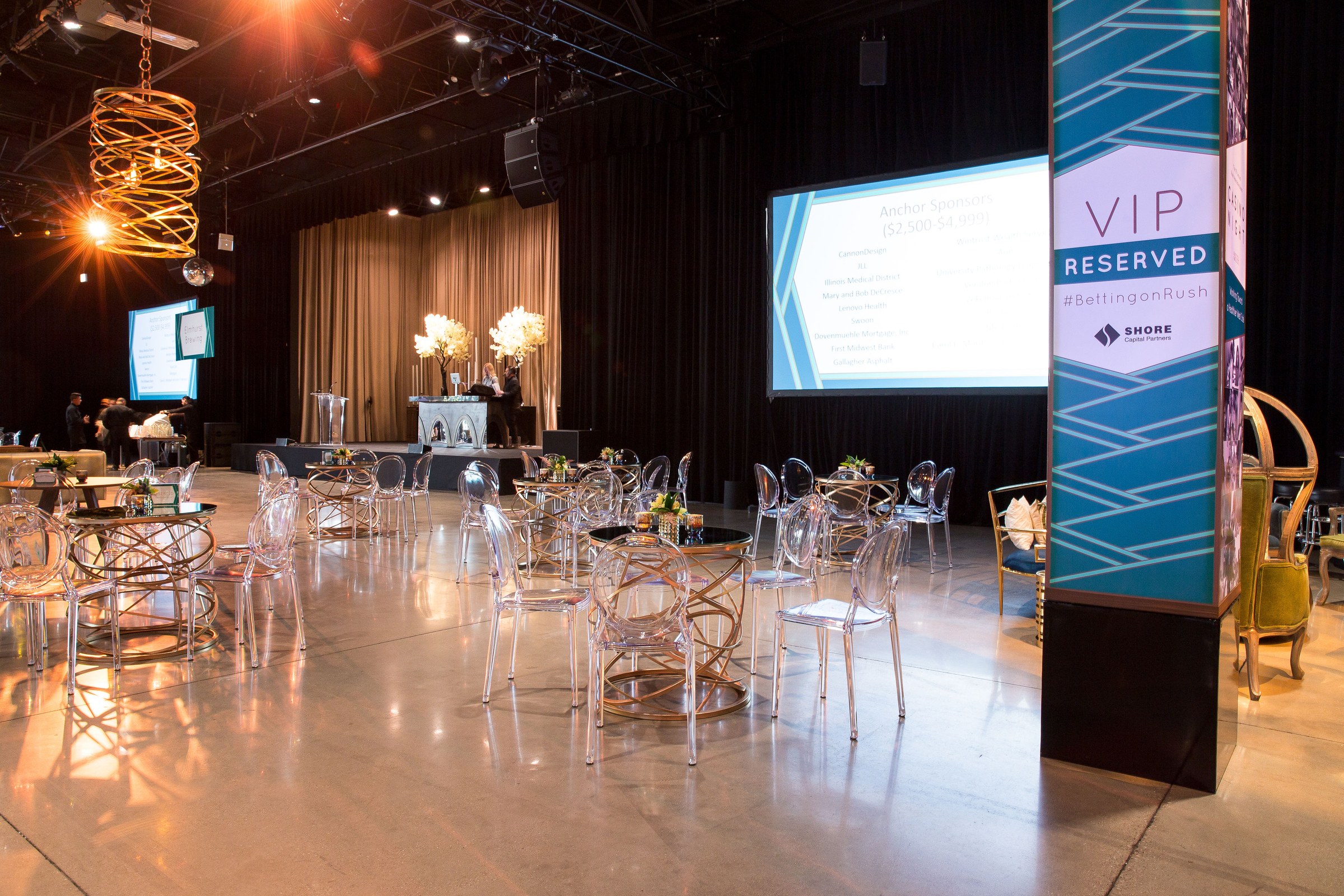
Event banners and stage graphics.