Identity Design
Red Leaf Marine Identity
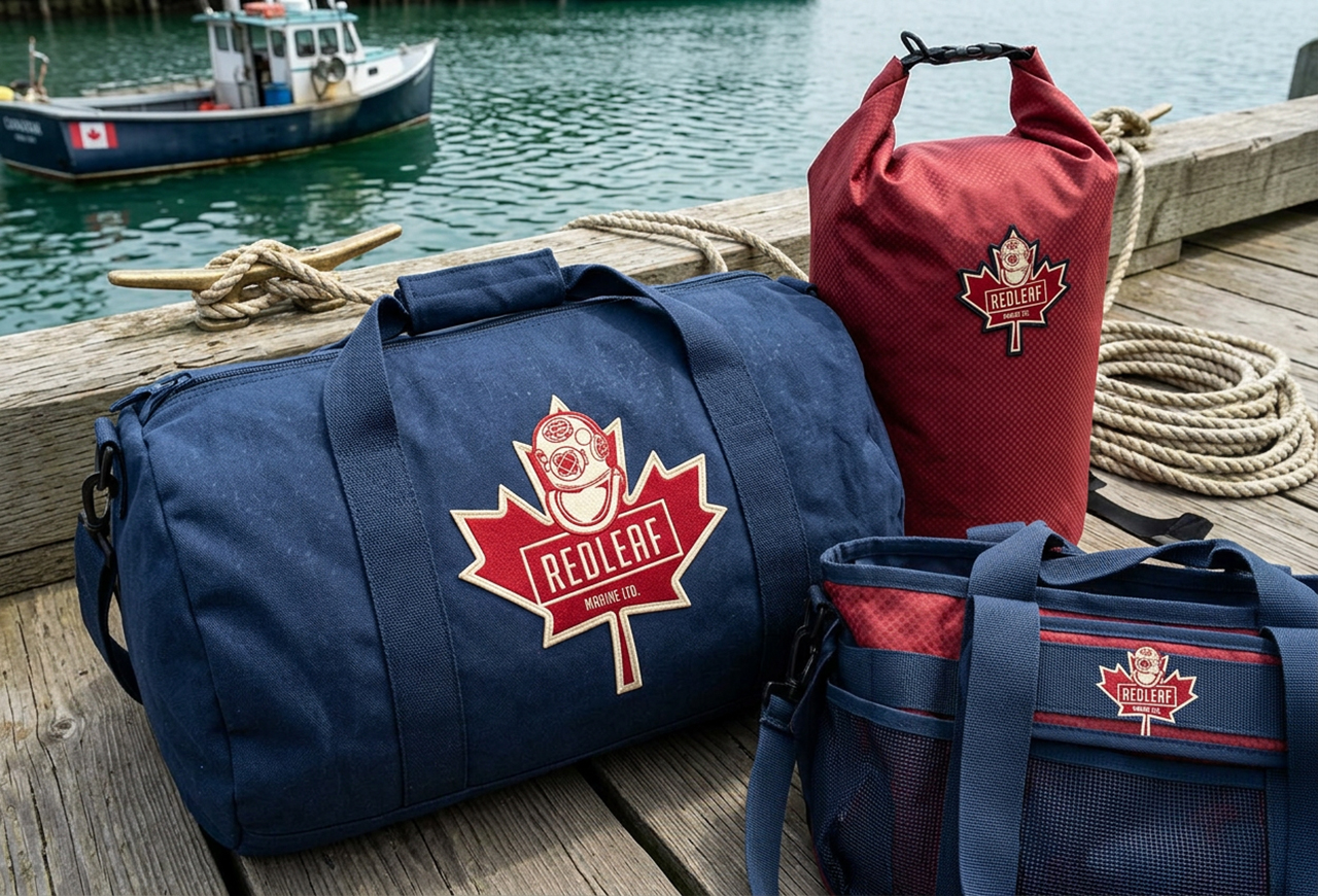
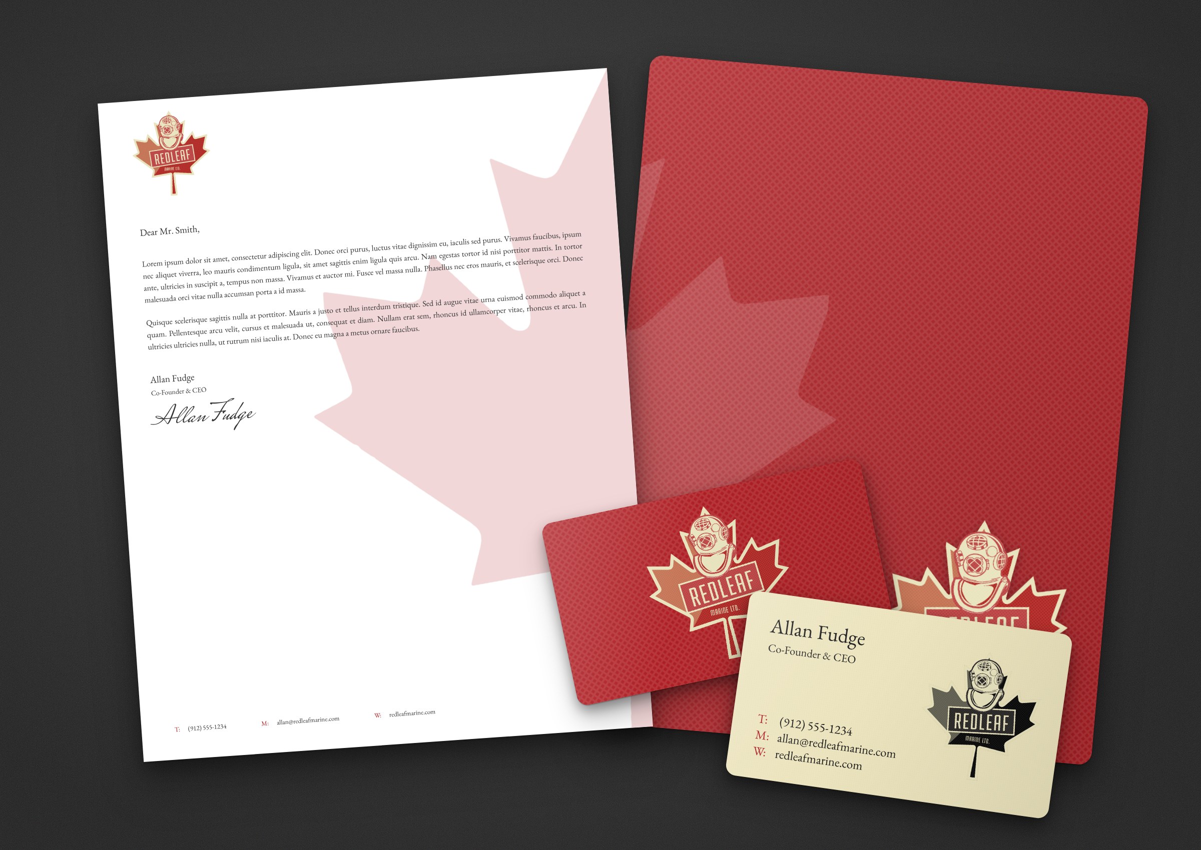
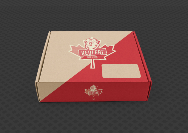
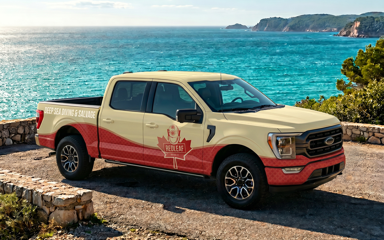
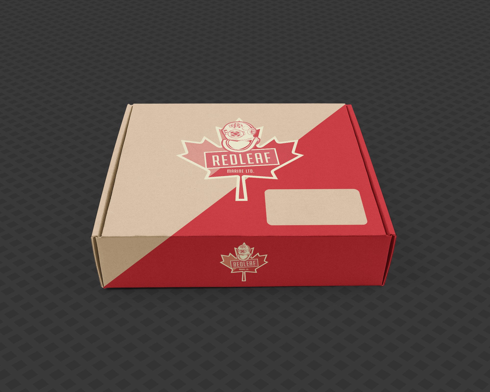
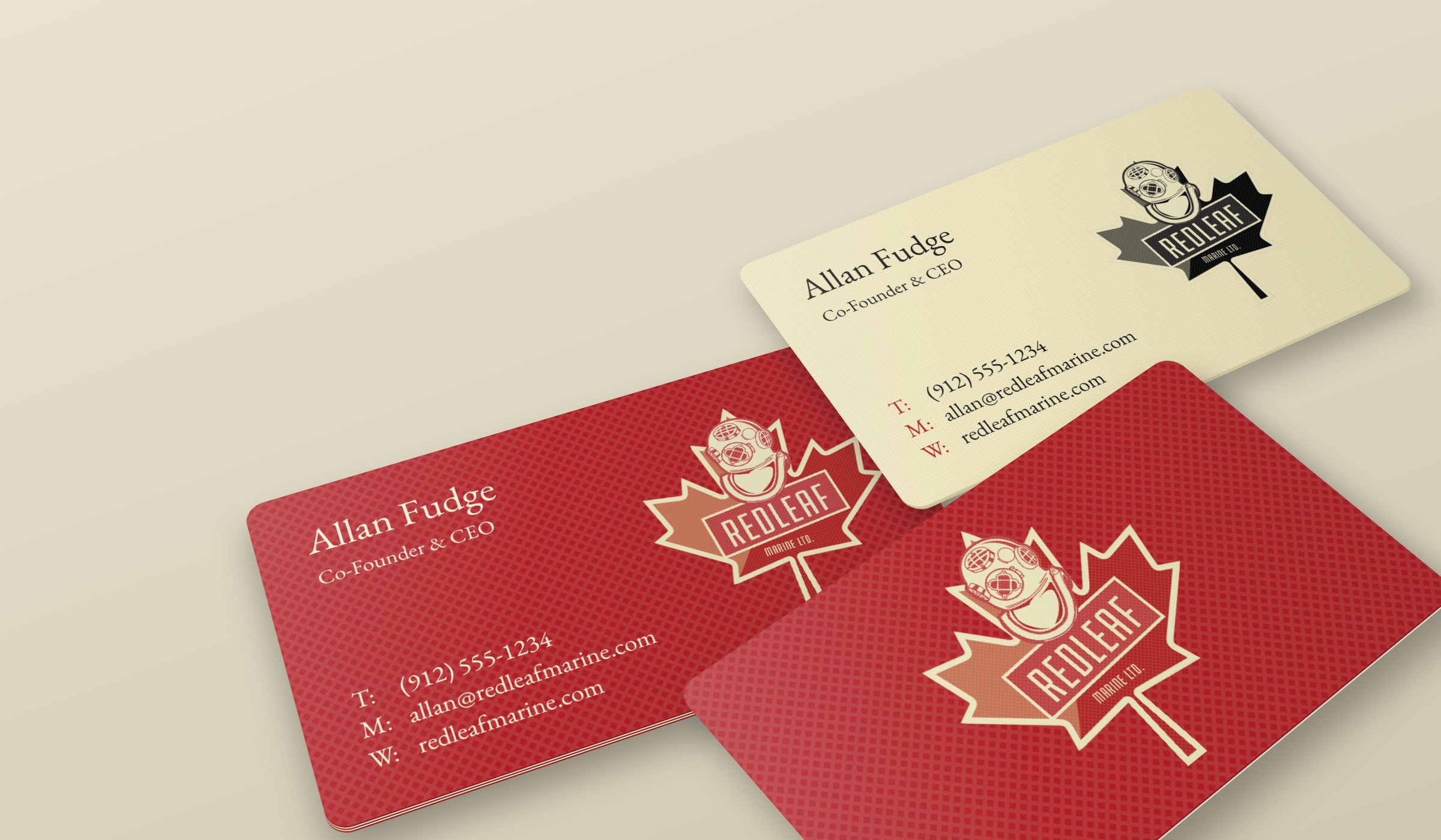
Red Leaf Marine Ltd. is an owner-operated deep-sea diving company in Canada, and this project gave it a complete brand identity. The owner needed a brand that could stand beside the established names in commercial diving and still feel like his own. I designed the logo and its colour versions, a palette and signature lattice pattern, business cards, letterhead, a presentation folder and branded packaging, so every piece the company hands a client carries the same rugged, recognisable look.
Objective
Create a mark that says Canadian and deep-sea diving at a glance, holds up on everything from a business card to a shipping box, and feels as rugged and trustworthy as the equipment divers depend on.
Strategy
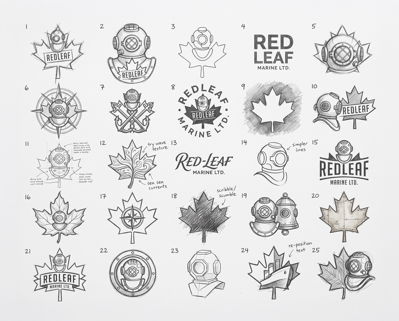
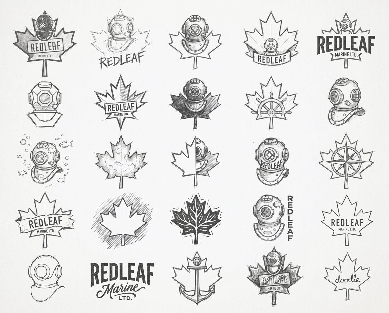
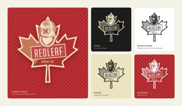
I combined the two ideas that define the company: the maple leaf and the classic brass diving helmet, with the helmet rising out of the top of the leaf. The REDLEAF wordmark sits in a stamped plate like an equipment badge, and halftone shading gives the mark a vintage, screen-printed feel. Five versions of the logo (full colour, khaki, monochrome, cream and reversed) keep it legible on any surface.
Colour & Pattern
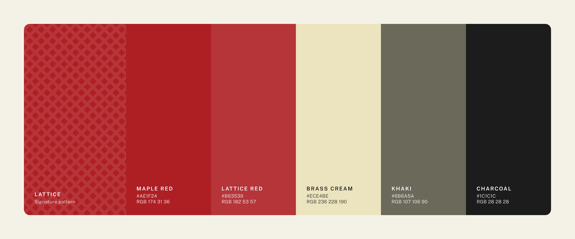
Maple red and brass cream lead the palette, backed by khaki and charcoal. A diamond lattice pattern carries the brand across stationery and packaging, even where the logo is small.