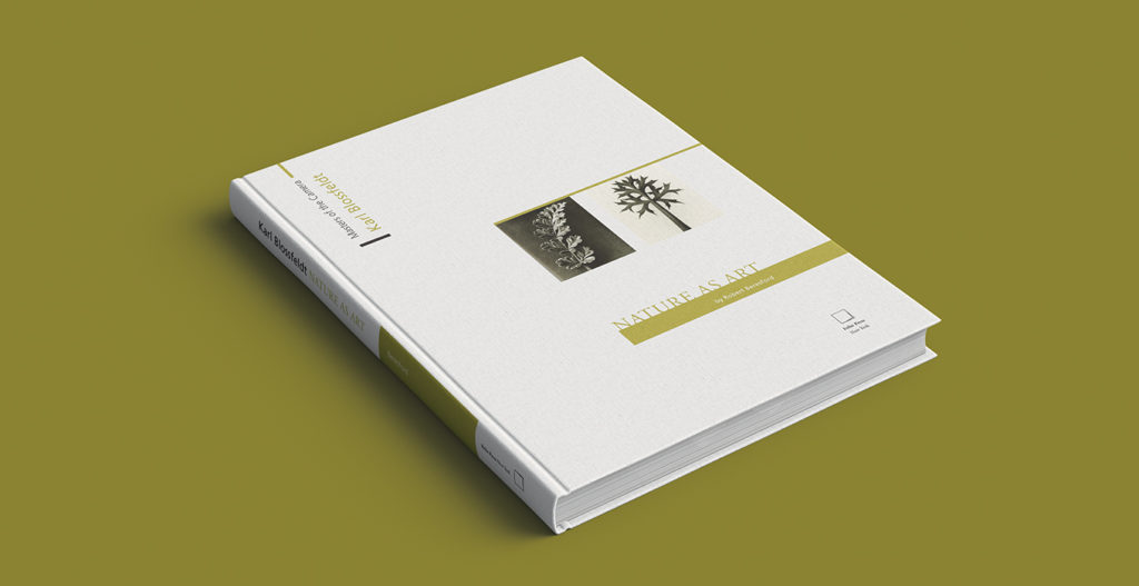
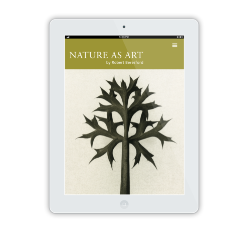
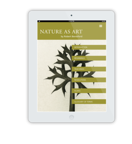
"NATURE AS ART" BOOK AND WEBSITE DESIGN
OBJECTIVE
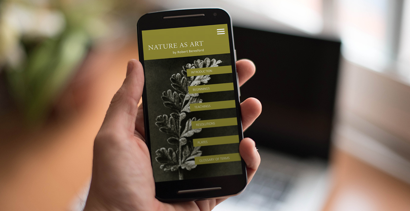
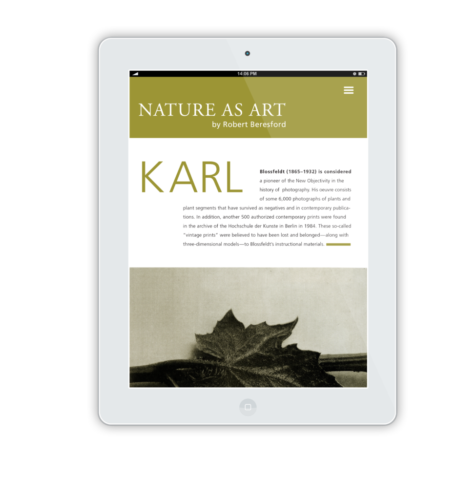
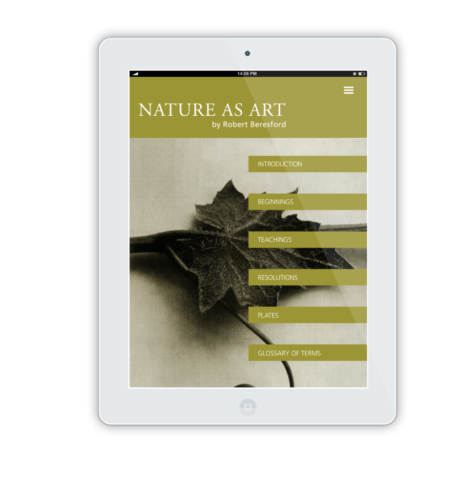
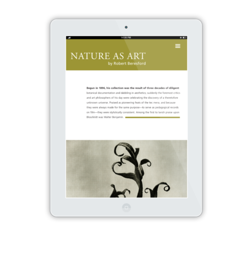
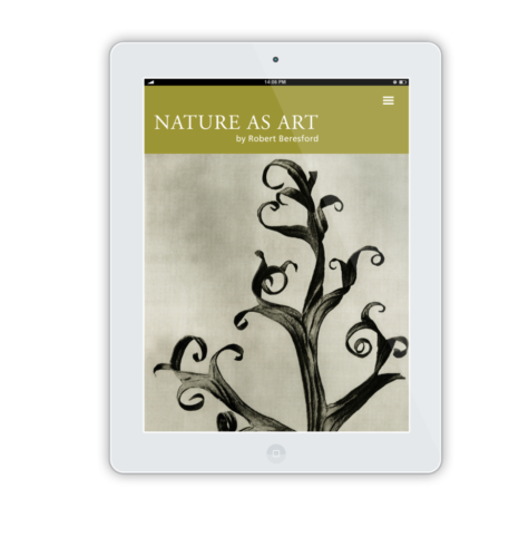
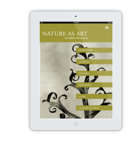
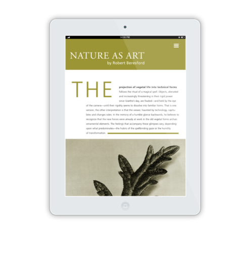
Design unique typographical and hierarchical solutions that work as a system, while highlighting the natural beauty of botanical photography.
STRATEGY
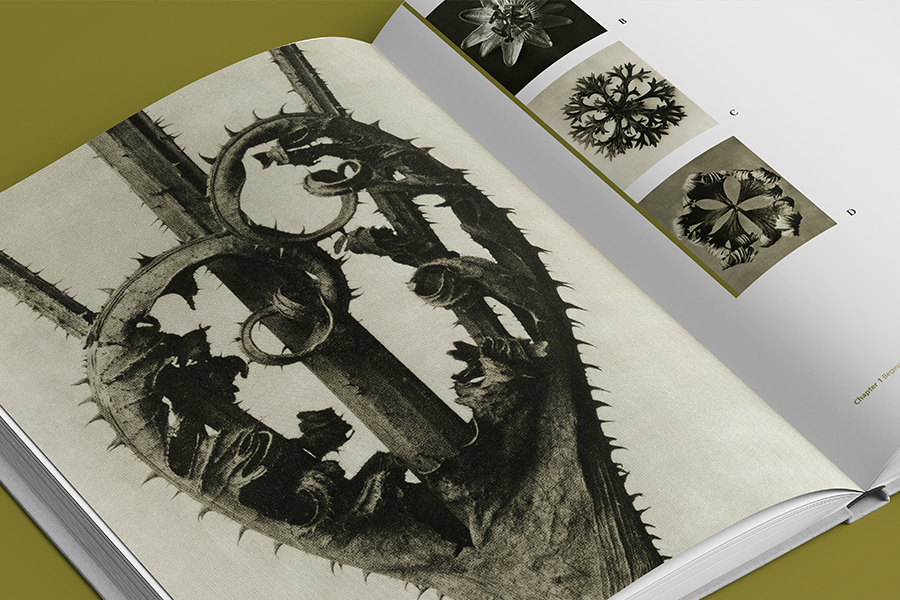
In this project, Karl Blossfeldt: Nature as Art by Robert Beresford was explored as an example of developing an organized hierarchy, layout and grid system. Blossfeldt became known for highlighting previously unseen details in his photographs of plants, flowers and seeds.
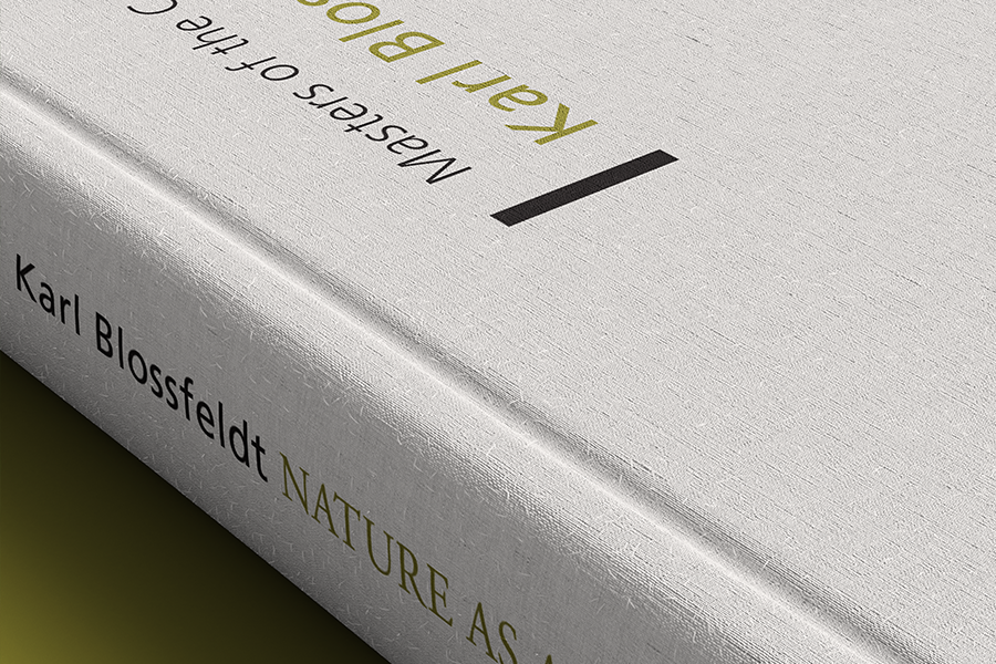
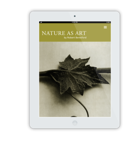
The color choices reflect the earthy, and sometimes gloomy mood of the photos. A consistent grid keeps the type in mind and in order, while also allowing for creative use of the negative space. The photographs themselves ultimately drove the structure of this project. Their intricacy is contrasted by a simple layout, which allows them to be the focus, and the serif fonts have an almost stem-like feel, reflecting the details in the organic subject matter.
DELIVERABLES
Book
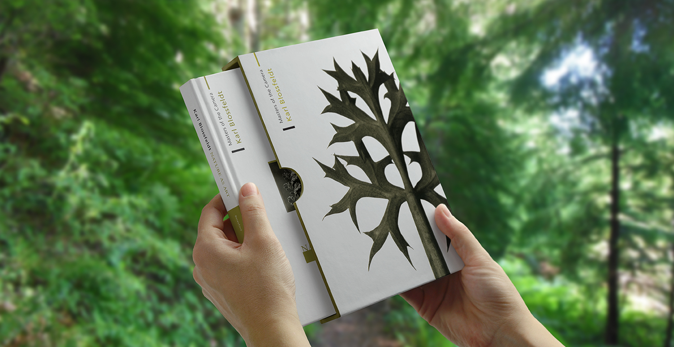
Slip Cover
Educational App
CATEGORY
Typography
Page Layout


